Composition in Architectural Rendering
July 3, 2013
I spend a lot of effort trying to come up with the best composition in my illustrations and so I try to think about the ideal placement of every element. Sometimes the layout just falls into place very easily and sometimes it's more of an effort. In this example, I will walk you trough my process of setting up the rendering of a classroom. The purpose of this image was to show a new classroom, with the classroom activity being most important element.
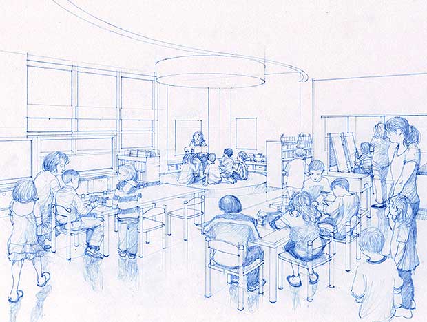 1. I use a blue pencil when I sketch and then de-saturate the blue in Photoshop so it looks like I used gray pencil. I used the figures of kids at the bottom right and left to frame my image. The foreground figures also create more depth in the rendering and bring more focus to the center of the image. In order to maintain your focal point, avoid having people close to the edges in your renderings looking away from the center of the image. Also, do not have people in the rendering looking directly at the camera. In both of these situations, the viewer's eye is drawn away from the focal point of the rendering.
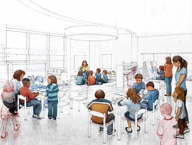 2. After receiving client feedback, I removed three children who appeared to be on their own (outlined in red) and added three children involved in activities (outlined in blue). It was important to the client that all children were involved in activities and appeared to be supervised.
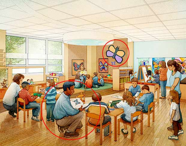 3. I added another adult figure. I thought that the ideal placement would be at the bottom between the two tables in the area that appeared a little empty.
 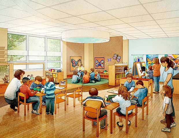 4. In this pass, the adult figure that was added in the last iteration proved to dominate the image too much and I did remove it. I adjusted the size and contrast of the butterfly graphic on the pin up wall in order to keep the focus on the activity in the room.
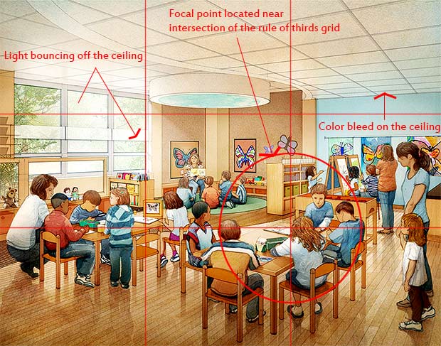 5. I added two more children sitting at the tables to fill the activity gap that I created by removing the staff person in the foreground. In addition, the ceiling was reading too flat so I added more contrast and color bleed. Even though the ceiling is just a coarse white acoustical tile, it will still reflect colors. The light coming into the room from outside is bouncing off the ceiling so I wanted to emphasize that by creating greater contrast just above the window.
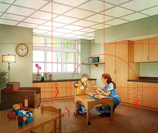 6. I try to use rule of thirds as the basic framework for the rendering, defining a focal point at the crossing of the lines. The focal point is a point where your eye comes to a resting point in the image. The focus in this example is the adult who is interacting with a child at a table. They are placed at the intersection of my rule of thirds grid. The objects, in this case the furniture, are all oriented to support that focal point.
I also added some color bleed on the ceiling, as in the previous example. The green color of the walls is reflected on the white ceiling, although it's very subtle and diffused. The light is bouncing off the ceiling just above the window just like in the previous example.